New Year, New Name: Introducing A Beautiful Plate
The big reveal has arrived! My stomach is full of butterflies and I feel like I’ve been on an adrenaline high for a week. I have anxiously and excitedly awaited to share this secret with you for the past three months.
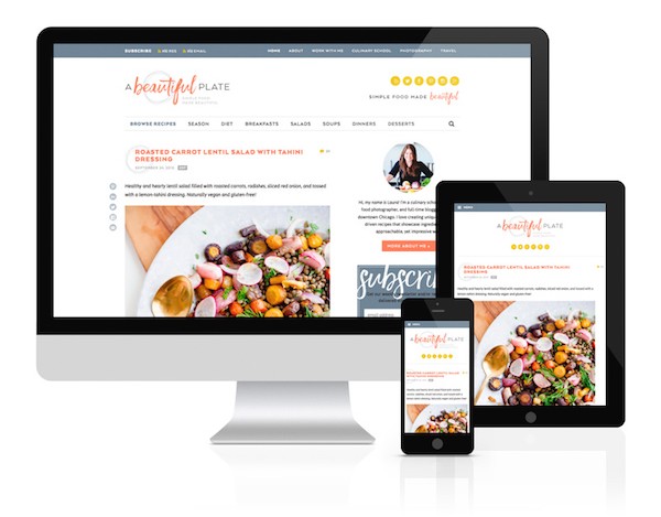
Blogging Over Thyme has rebranded itself as A Beautiful Plate. New year, new name, new tagline, new look! We’re starting 2016 off with a big, big bang.

When I first started this blog in 2010, I had no idea where it would take me in the five years that followed. Since that fateful day, I made the decision to enroll in culinary school and ultimately turn this site into a dream job. More importantly, I’ve made amazing connections with readers and bloggers alike.
Blogging Over Thyme will always be sentimental to me (please continue to share thyme puns with me!), but I’m excited for what this new name and focus will offer. Both creatively and professionally. I’ve put on my big girl pants so to speak. A Beautiful Plate represents what I’m passionate about: sharing simple, beautiful recipes. Whether that’s showcasing the beauty of real food, presenting an ingredient in a new way, or sharing my love for food photography.
With this new site and redesign comes a few housekeeping notes:
- Links: All links, including recipe links, will automatically redirect from www.bloggingoverthyme.com to www.abeautifulplate.com. If you run into technical issues or find broken links today or in the coming weeks, please let me know! I’ll love you forever!
- Social Media: To support the new name and redesign, all of my social media handles will be updated as well. If you’re already following the blog on Instagram, Pinterest, Twitter, or Facebook – you will be automatically be following A Beautiful Plate (new universal handle: @abeautifulplate).
- Email/RSS Feed: If you are subscribed via email or RSS, this will update automatically (in fact, you should have received this post!). No need to re-subscribe or change your preferences.
To go along with new name, I’ve got a brand spankin’ new design (and new mobile view) with amazing new features! For the past three months, I’ve been working with Lindsay Landis of Purr Design (the best of the best) to bring about some incredibly exciting changes to this space. Feel free to poke around the site (I recommend visiting it on a desktop to see it in all its glory), explore the menus, sidebars, and familiarize yourself with the new site.
Here are some of my favorite highlights of the new re-design and site:
50% Less Ads + Faster Loading Times:
- My biggest priority for this re-branding process was to reduce the number of advertisements. Unfortunately, ads are a necessary evil to help support the blog, but this new site will be displaying half the number of ads that it did previously. Not only will this result in faster website loading times, but hopefully a significantly improved user experience. Cheers to that!
New Recipe Index + Search Functions:
- Another incredibly exciting feature of the new site is an improved recipe index (found by clicking on the ‘browse recipes’ link in the main navigation menu). I’ve spent tens of hours re-indexing, re-categorizing, and re-tagging every single recipe in the archives to make these categories as logical and comprehensive as possible. Even I (and I made them!) had trouble finding recipes on the old site.
- On this new page, you can search for recipes by category or subcategory, or even by ingredient, making it easier for you to find a recipe that suits your diet or what’s in your fridge at any given time. You can even browse recipes by season!
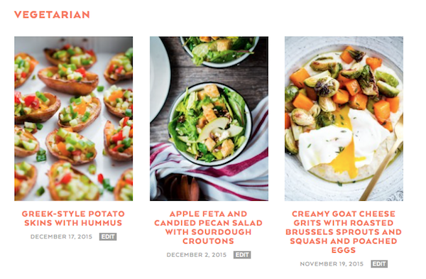
- The best part? When you click on any category, you are brought to a page with a visual recipe index.
Clean + Functional Navigation Menus:
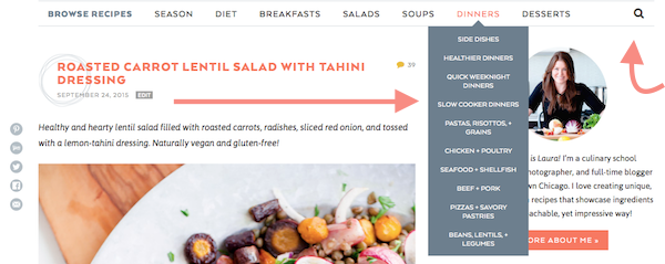
- The navigation menus have gotten a complete makeover! The main navigation is now dedicated exclusively to recipes, and recipe categories only – and I kind of love it. It is clean and functional. You can search by diet type (think vegetarian, gluten free recipes, etc.) or by season.
- While there are recipe categories that aren’t featured in the main menu (side dishes, drinks, sandwiches), the most commonly searched categories are front and center. The best part? Hover over a menu page and a dropdown will allow you to quickly narrow your search. Looking for a dinner recipe? Just hover over the ‘dinners’ menu tab and you find almost any recipe type, including quick weeknight dinners to healthier dinners and lots more.
New Top Menu:
- If you’re looking for non-recipe pages, you can now find them in the new top menu, which provides an easy link to everything from my old culinary school posts (completely re-categorized!), as well my about and contact page. There is a new travel page too!
Updated Recipe Formatting + ‘Tips for Success’ Feature:
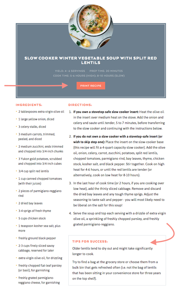
- The recipe formatting has a beautiful new two-column design (the ‘print recipe’ button allows you to print any recipe off the site from your browser or mobile device).
- I’ve also introduced a new tips for success recipe feature, which will provide everything from ingredient, cooking, as well as styling and presentation tips. Double cheers to that!
Easy to Find Subscribe Options:
- There are now tons of easy and accessible ways to subscribe to the blog – either by signing up for my newsletter (you can choose to sign up for new posts or one weekly e-newsletter). Right below, there is option to add the blog to your Bloglovin’ or Feedly subscription list as well!
Related Posts + Recommended Products:
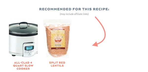
- If I’ve used a specific kitchen tool or hard-to-find ingredient (and feel like this information could be beneficial to you!), I’ll be providing easy links and information for these things below recipes from here on out. I love this feature, because it’s visual and often times, I’ll order specialty items online and want to tell you all about them!
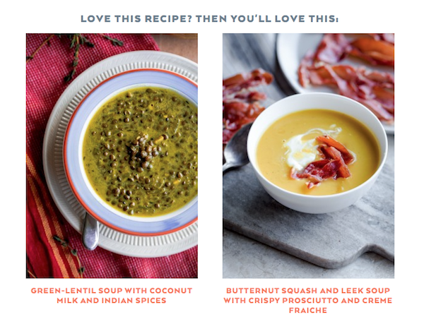
- Remember the suggestions for ‘related posts’ on the bottom of my old posts? Yeah, those were awful. Half the time, the posts weren’t related at all (unfortunately, they were randomly generated). A new related posts feature allows me to hand-choose recipes that are actually similar to a given recipe – and you can find these at the bottom of each post. Simply click on the image or recipe name to open that recipe post in a new tab. It’s that easy.
New (Straight-Forward) Social Media Handles:
- From this point forward, you can find me on all social media platforms at @abeautifulplate [with the exception of Facebook, where I’ll be continuing to post on my old page until Facebook merge my pages – hopefully soon!].
Most importantly, thank you for being here, supporting this site, and sharing my excitement with this big change. I hope you love the new look and name as much as I do!




99 Comments on “New Year, New Name: Introducing A Beautiful Plate”
The new site looks beautiful. That had to be hard to keep secret. I like the ease of navigation. Way to get your 2016 on!!
Thank you so much Mo! So thrilled that you like it!
It’s gorgeous, Laura! I love the new navigation features, the lettering, AND the name. Huge congratulations!
Congratulations on the new design and the new name! Love the name! Very fitting….
my main question… are you still going to post The Sunday Thymes??? I so loved that!
Yes!!! It will be back this weekend! Just took a break for the holidays and while I was finalizing the new website design. Thanks Catherine!?
Laura! Your new site is absolute gorgeous! I love the new name…it really represents your food and site so well. Congratulations!
Love the new design and name! It’s beautiful!!
Thank you so much Erika! I’m so glad you like it! 🙂
Love the new look…Chicago is one of my favorite places in the world…please keep sharing your new finds from Chicago.
Hey Lisa! I’d love to hear what you’d be interested to read about? Just general Chicago life posts (what we’re doing + photo posts) or restaurant recommendations? One of my goals this year is to write a lot more about Chicago (because this city is so much fun) and I’d love any feedback you could provide.
I love the new design! Everything so beautiful and streamlined I’m so happy for you and this exciting change!
Thank you so much Amanda! Means a lot!
Oooooh how exciting Laura!! LOVE the new site and the new name 😀 Congrats!!
Thank you, thank you!!!! 🙂
Your site looks stunning, simply beautiful. Lindsay always out does herself! I love your whole new look! Xx
Thank you!!! Lindsay is the best, as you know! 🙂
It’s just gorgeous, Laura! Congratulations!
Thank you so much Stephanie!
Love the new site! It’s beautiful!! Congrats!
Thank you Erin! I love that you love it!
Ooh, I love it! Crisp and fun and lovely. Cheers to change and a fresh new year!
Thank you so much Meg! I’m excited for the change – it’s a fun way to start the new year!
Gorgeous Laura!!
Thanks nana!! Glad you like it. Thanks for the feedback on the design during the process!
So beautiful (just like you and your photography!) <3
You’re so kind!!! Thank you Christina! Although I can’t take credit for 98% of it. Lindsay was a joy to work with again.
It’s a gorgeous design… love it!!
So thrilled that you think so! Lindsay did a fantastic job and I’m so happy to have a new home in this space.
Ads in the middle of the article look awful. Do you use free WordPress?
Oleg – there shouldn’t be any ads displaying in the middle of this specific article. This a custom theme and I work with an ad network. Are you seeing that ad on this post or just others? Unfortunately, I did have to make some tough calls on ad placements (in order to reduce them by over 50%, so some posts will now contain one ad within the post itself. This is dramatic decrease from the old site, but ads allow me to continue to produce free content for this site and visibility is a requirement these days! I hope you come back and visit!
Whatt???! I had no idea you were even doing this! SO exciting, and the site looks STUNNINGLY beautiful! So excited for you girlfriend. If I could describe you and your food/blog in one phrase it would definitely be simple food made beautiful. So perfect.
I know! Haha! I was super tight lipped about it because I was paranoid something would go wrong halfway through the process (or the new name would get taken). Thank you so, so much for saying that!!! Hope you’re enjoying tons of cuddle time with the babe.
AAAAHHH!! Laura, I LOVE all of it!! It looks absolutely fantastic – the logo, the site, – so streamlined and clean and I especially love that recipe index!
You definitely did put your big girl pants on and look how far you’ve come in a year, girl. YOU have made amazing things happen and I’m so very psyched for you!!
Here’s to 2016 being EPIC – you’re off to a great start!
You’re the sweetest Lynne! Your words never cease to put a smile on my face. Hope we can hang out again soon (and I’ll be emailing you shortly!). Cheers to big girl pants!
Congrats on the rebranding!! Love the name and your site looks absolutely gorgeous!!
Thank you so much Cyndi! It was a crazy decision and process, but I’m so excited for what the new site and name has to offer.
It all looks so beautiful and polished and professional and just absolutely perfect! Congratulations! So so exciting!
Gah! Thank you so much! I’m so, so happy that you feel that way!
I’ve pretty much been texting you all day and you know how i feel about your rebrand and new design. OBSESSED. Love love!
You’re enthusiasm is catagious! Thank you so much! And thanks for being my voice of reason when I freak out, as I tend to do. Haha!
This new site is an eye candy and SO functional!!! Love all of it, well done you, it’s a brave move!! 🙂 Happy New Year, Laura!
Eee! Thank you Julia!
Laura, this new site is absolutely gorgeous! Though I loved the thyme puns, will miss them! So happy for you. Congrats!!
Haha! I’ll have to share more thyme puns to make up for the switch. Hold me to it! 😉
Laura, I love the look of the new website and the rebrand! Everything looks so looks so clean. I’m sure you worked very hard on this, so bravo to you (and your designers)!
I have to give most of the credit to Lindsay, but I’m so glad you like it! xo
Wow, this looks great! Love the rebrand 🙂 Congratulations!!
Thank you! I’ve been on pins and needles all day!
Laura!!! I’m so thrilled to see this come to fruition! Logo, functionality and of course the new name are all SO YOU! I can’t wait to see what the rest of 2016 brings for you. Way to go on having the guts to make the change, it is perfect.
Heidi – this couldn’t have happened without your encouragement. Thanks for everything! And for being such a great friend and voice of reason. xoxo
I absolutely love the rebrand my friend. It is stunning! Such a beautiful reflection of your work. Go A Beautiful Plate!!
Thanks friend!!! You’re the best!
Congrats, Laura – what an amazing way to begin the new year. LOVE your new design!
I’m so glad you like it! Thank you!
It’s beautiful! Congratulations! What a great way to start the new year.
It really does feel like such a fun way to start off the year! Thanks Barbara!!
Congrats again!! I love the new look and name and especially the color scheme 🙂
I’m so excited for the color scheme too! I wanted to add more color and warmth and am excited for the change!
Oh my gosh, this is GORGEOUS!!! I LOVE the new name, look and all the new features! I especially love the tag line. Simply stunning!
I’m so glad you like the tag line! I credit many fellow blogging friends for helping me brainstorm! Thanks Meghan!
Congratulations on the rebrand!!! Everything looks gorgeous.
Thanks Brandon!! I think it’s the biggest secret I’ve had to keep in a while and it’s a relief to finally share the news. 🙂
Congrats on rebranding Laura! I love the name and your site looks beautiful!
Thank you Danae! Appreciate it!
Congrats on all your progress! Sounds like you’re really doing what you love. And I just wanted to add… thank you for reducing your ads. I am actually starting to back away from those having overwhelming ‘adage’.
Thank you sharing your thoughts! I love to hear that you’re excited for the change too. I’m really excited for fewer ads and hopefully an improved reading/viewing experience. Thanks Denimo!
From a longtime reader, I just have to say this looks incredible! And your pictures are truly always of “a beautiful plate.” Congrats!
THANK YOU EMMA!!! Firstly, thank you for sticking around for the long haul. You’ve probably seen my old, OLD designs (shudder). So glad you’re here! And like the new name!
This is SO beautiful. Congratulations on the big step Laura!! I seriously look up to bloggers like you as a newbie so I’m in awe of your site! Love it 🙂
That is so kind Erica. Thank you so much for sharing my excitement!
This looks INCREDIBLE!!! I am so so sooooo happy for you Laura, and I love the new name. Isn’t Lindsay the best? Well done. The transition was so smooth, and I love all of your new features and functionality too!
Couldn’t have done it without your support, advice, and e-book! Thank YOU!
Stunning!! And practical, love love love it lady!! Though I will miss your old name 🙁
Stacy! Thank you!!!! I still love the old name, but I felt it was ‘thyme’ (ha ha) for a change 😉
Congrats on the big change! So excited for you and what’s to come. Love the redesign and new name!!
Appreciate it so much Rachel! Thanks for checking it out!
Very similar logo to Well Plated by Erin……which was her blog name change last year! Thought you might want to know! Nice organization though! Congrats!
Hi Heidi! I’m actually good friends with Erin and her support and advice (and e-book) throughout this rebrand process has been invaluable!
What an exciting new chapter of blogging for you!! I am so excited for you and wishing you all the best in this new year and new adventure! LOVE the name and site design!!
Thank you so, so much. You’re the best!
So gorgeous and I love all the new features. You have thought of all the small details and really made a great site! Congrats!!
Thank you so much Shawn! I’m glad that I embarked on the process! Scary, but worth it so far.
I am SO proud of you for doing this. The site looks incredible and is such a fantastic way to start off your 2016. Love that you included this little tutorial post, too! You freaking rock, girlfriend! #abeautifulplate forever!
Thank you so much Sarah! I’m so glad you were there when all of rebrand talk first occurred. Your ideas, encouragement, and enthusiasm are so appreciated! Cheers to new (and improved) hashtags!
The new site looks fantastic! Hurray for you;) I made your Bucatini with Porcini Ragu last night for dinner……..holy moly! Great adaptation of Batali’s meal! Thanks!
Oh yes! That’s one of my favorites. Haven’t made it in far too long. Thank you so much Cristina! Your support means so much to me.
Wow! Congratulations on the big move. It’s beautiful and and runs very smooth.
I’m thrilled to hear that! Thank you!
GIRL! Congrats on this GORGEOUS new site. I can’t wait to poke around more and discover all the new things. Cheers to 2016!
Can’t tell you how much that means to me! Thanks Liz!!! 2016 is looking good so far.
It looks great and clean!
Thank you Meagan!!! xo
Oh! I’m so excited to finally see it all in action! It looks beautiful! Congratulations sweet friend!
Thank you for putting up with my endless texts and “do you like this?” design questions over the weeks. Can’t wait to celebrate with fluffy pancakes tomorrow morning!
LOVE IT! So happy for you!! xo
Thank you so much Maria! Your support helped make this happen!
Congrats on your rebranding!! I rebranded about 5 years ago and it was the best decision ever for me! And yours looks wayyyyy more smooth and streamlined than mine did!
Love your new look and the site is gorgeous!! Lindsay outdid herself, wow, just gorgeous!
I remember your rebrand! Hopefully I’ll be just as successful with mine – you have set the bar!
Lindsay is a life-saver. I never could have done this without her!